|
In recent years the collection of statistical data has grown
at such a rate that it would be impossible to keep up with even
a small part of the things that directly affect our lives unless
this information is disseminated in "predigested" or summarized
form. The whole matter of putting large masses of data into a
usable form has always been important, but it has multiplied
greatly in the last few decades. This has been due partly to the
development of computers, which was previously left undone
because it would have taken months or years, and partly to the
deluge of data generated by the increasingly quantitative
approach of the sciences, especially the behavioral and social
sciences, where nearly every aspect of human life is nowadays
measured in one way or another.
The most common method of summarizing data is to
present them in condensed form in tables or charts, and at one
time this took up the better part of an elementary course in
statistics. Nowadays, there is so much else to learn in
statistics that very little time is devoted to this kind of
work. In a way this is unfortunate, because one does not have to
look far in newspapers, magazines, an even professional journal
to find unintentionally or intentionally misleading statistical
charts.
In Sections 3.1 and 3.2 we shall present ways of listing data
so that they present a good overall picture and, hence, are easy
to use. By listing we are referring to any kind of treatment
that preserves the identity of each value (or item). In other
words, we rearrange but do not change. A speed of 63 mph remains
a speed of 63 mph, a salary of $75,00 and when sampling public
opinion, a National Party remains a National and a Wafdy remains
a Wafdy. In Sections 3.3 and 3.4, we shall discuss ways of
grouping data into a number of classes, intervals, or categories
and presenting the result in the form of a table or a chart.
This will leave us with data in a relatively compact and
easy-to-use form, but it does entail a substantial loss of
information. Instead of a person's weight, we may know only that
he or she weights anywhere from 160 to 169 pounds, and instead
of an actual pollen count we may know only that it is medium
(11-25 parts per cubic meter). |
|
3.1 Listing
Numerical Data
Listing and thus, organizing the data is usually
the first task in any kind of statistical analysis.
As a typical situation, consider the following data,
representing the lengths (in centimeters) of 60 sea trout caught
by a commercial trawler in Bay Area :
|
19.2 |
19.6 |
17.3 |
19.3 |
19.5 |
20.4 |
23.5 |
19.0 |
19.4 |
18.4 |
|
19.4 |
21.8 |
20.4 |
21.0 |
21.4 |
19.8 |
19.6 |
21.5 |
20.2 |
20.1 |
|
20.3 |
19.7 |
19.5 |
22.9 |
20.7 |
20.3 |
20.8 |
19.8 |
19.4 |
19.3 |
|
19.5 |
19.8 |
18.9 |
20.4 |
20.2 |
21.5 |
19.9 |
21.7 |
19.5 |
20.9 |
|
18.1 |
20.5 |
18.3 |
19.5 |
18.3 |
19.0 |
18.2 |
21.9 |
17.0 |
19.7 |
|
20.7 |
21.1 |
20.6 |
16.6 |
19.4 |
18.6 |
22.7 |
18.5 |
20.1 |
18.6 |
The mere gathering of this information is so small
task, but it should be clear that more must be done to make the
numbers comprehensible.
What can be done to make this mass of information more usable?
Some persons find it interesting to locate the extreme values,
which are 16.6 and 23.5 for this list. Occasionally, it is
useful to sort the data in an ascending or descending order. The
following list gives the lengths of the trout arranged in an
ascending order.
|
16.6 |
17.0 |
17.3 |
18.1 |
18.2 |
18.3 |
18.3 |
18.4 |
18.5 |
18.6 |
|
18.6 |
18.9 |
19.0 |
19.0 |
19.2 |
19.3 |
19.3 |
19.4 |
19.4 |
19.4 |
|
19.4 |
19.5 |
19.5 |
19.5 |
19.5 |
19.5 |
19.6 |
19.6 |
19.7 |
19.7 |
|
19.8 |
19.8 |
19.8 |
19.9 |
20.1 |
20.1 |
20.2 |
20.2 |
20.3 |
20.3 |
|
20.4 |
20.4 |
20.4 |
20.5 |
20.6 |
20.7 |
20.7 |
20.8 |
20.9 |
21.0 |
|
21.1 |
21.4 |
21.5 |
21.5 |
21.7 |
21.8 |
21.9 |
22.7 |
22.9 |
23.5 |
Sorting a large set of numbers in an ascending or
descending order can be a surprisingly difficult task. It is
simple, though, if we can use a computer or a graphing
calculator.
In that case, entering the data is the most tedious part. Then,
with a graphing calculator we press STAT and 2, fill in the list
where we put the data, press ENTER, and the display screen
spells out DONE.
If a set of data consists of relatively few
values, many of which are repeated, we simply count how many
times each value occurs and then present the results in the form
of a Table or a dot diagram. In such a diagram we indicate by
means of dots how many times each value occurs.
Example (1)
An audit of twenty tax returns revealed 0, 2, 0, 0, 1, 3, 0,
0, 0, 1, 0, 1, 0, 0, 2, 1, 0, 0, 1, and 0 mistakes in
arithmetic.
(a)
Construct a table showing the number of
tax returns with 0, 1, 2, and 3, mistakes in arithmetic.
(b)
Draw a dot diagram displaying the same
information
Solution:
Counting the number of 0's, 1's, 2's and 3's we find that they
are, respectively, 12, 5, 2, and 1. This information is
displayed as follows, in tabular form on the left and n
graphical form on the right.
|
Number of mistakes |
Number of the returns |
|
0
1
2
3 |
12
5
2
1 |

Number of mistakes
Number of Mistakes
There are various ways in which dot diagram can be
modified, for instance, instead of dots we can use other symbols
such as x's,«'s,
or²'s. Also, we could align the dots
horizontally rather than vertically.
The methods we used to display relatively few numerical
values, many of which are repeated, can also be used to display
categorical data.
Example (2)
The faculty of a university's mathematics department consists
of four professors, six associate professors, eleven assistant
professors, and nine instructors. Display this information in
the form of a horizontally aligned dot diagram.
Solution:
|
Faculty Rank |
|
|
|
|
|
|
|
|
|
|
|
|
Professor |
² |
² |
² |
² |
|
|
|
|
|
|
|
|
Associate professor |
² |
² |
² |
² |
² |
² |
|
|
|
|
|
|
Assistant professor |
² |
² |
² |
² |
² |
² |
² |
² |
² |
² |
² |
|
Instructor |
² |
² |
² |
² |
² |
² |
² |
² |
² |
|
|
Another way of modifying dot diagram is to replace
the numbers of dots with rectangles lengths are proportional to
the respective numbers of dots. Such diagrams are referred to as
bar charts, and the rectangles are often supplemented with the
corresponding frequencies (number of symbols) as shown in the
next Figure of Example 3.
Example (3)
Draw a bar chart for the data of Example 3.1; that is, for the
numbers of mistakes in arithmetic in the twenty tax returns.
Solution:
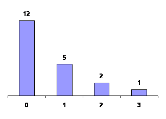
Bar Chart of Mistakes in Arithmetic in Tax Returns |
|
3.2
Stem-And-Leaf-Display
Dot diagrams are impractical and ineffective when
a set of data contains many different values or categories, or
when some of the values or categories require too many dots to
yield a coherent picture.
To give an example, consider the first –round scores in PGA
tournament, where the lowest score was a 62, the highest score
was an 88, and 27 of the 126 golfers shot a par 72. This
illustrates both of the reasons cited previously for not using
dot diagrams. There are too may different values from 62 to88,
and at least one of them, 72 requires too many dots.
In recent years, an alternative method of listing data has
been proposed for the exploration of relatively small sets of
numerical data. It is called a stem-and leaf display and it also
yields a good overall picture of the data without any
appreciable loss of information. Again, each value retains
its identify, and the only information we lose is the order in
which the data were obtained.
To illustrate this technique consider the following data on
the number of rooms occupied each day in a resort hotel during a
recent month of June:
|
55 |
49 |
37 |
57 |
46 |
40 |
64 |
35 |
73 |
62 |
|
61 |
43 |
72 |
48 |
54 |
69 |
45 |
78 |
46 |
59 |
|
40 |
58 |
56 |
52 |
49 |
42 |
62 |
53 |
46 |
81 |
The smallest and largest values are 35 and 81, so that a dot
diagram would require that we allow for 47 possible values.
Actually, only 25 of the values occur, but in order to avoid
having to allow for that many possibilities, let us combine all
the values beginning with a 3, all those beginning with a 4, all
those beginning with a 5 and so on. This would yield
|
37 |
35 |
|
|
|
|
|
|
|
|
|
|
49 |
46 |
40 |
43 |
48 |
45 |
46 |
40 |
49 |
42 |
46 |
|
55 |
57 |
54 |
59 |
58 |
56 |
52 |
53 |
|
|
|
|
64 |
62 |
61 |
69 |
62 |
|
|
|
|
|
|
|
73 |
72 |
78 |
|
|
|
|
|
|
|
|
|
81 |
|
|
|
|
|
|
|
|
|
|
This arrangement is quite informative, but it is
not the kind of diagram we use in actual practice. To simplify
it further,
we
show the first digit only once for each row, on the left and
separated from the other digits by means of a vertical line. This leaves us with
|
3 |
7 |
5 |
|
|
|
|
|
|
|
|
|
|
4 |
9 |
6 |
0 |
3 |
8 |
5 |
6 |
0 |
9 |
2 |
6 |
|
5 |
5 |
7 |
4 |
9 |
8 |
6 |
2 |
3 |
|
|
|
|
6 |
4 |
2 |
1 |
9 |
2 |
|
|
|
|
|
|
|
7 |
3 |
2 |
8 |
|
|
|
|
|
|
|
|
|
8 |
1 |
|
|
|
|
|
|
|
|
|
|
And this is what we refer to as a stem-and leaf
display.
In this arrangement, each row is called a stem, each number
on a stem to the left of the vertical line is called a stem
label, and each number on a stem to the right of the vertical
line is called a leaf. As we shall see later, there is a
certain advantage to arranging the leaves on each stem according
to size, and for our data this would yield
|
3 |
5 |
7 |
|
|
|
|
|
|
|
|
|
|
4 |
0 |
0 |
2 |
3 |
5 |
6 |
6 |
6 |
8 |
9 |
9 |
|
5 |
2 |
3 |
4 |
5 |
6 |
7 |
8 |
9 |
|
|
|
|
6 |
1 |
2 |
2 |
4 |
9 |
|
|
|
|
|
|
|
7 |
2 |
3 |
8 |
|
|
|
|
|
|
|
|
|
8 |
1 |
|
|
|
|
|
|
|
|
|
|
A stem-and-leaf display is actually a hybrid kind
of arrangement obtained in part by grouping and in part by
listing.
The
values are grouped into the six stems, and yet each value
retains its identity Thus, from the preceding stem-and-leaf
display, we can reconstruct the original data as 35, 37, 40, 40,
42, 43, 45, 46, 46, 46, 48, 49, 49, 52, 53, …, and 81, though
not in their original order.
There are various ways in which stem-and-leaf displays can be
modified For instance, the stem labels or the leaves could be
two-digit numbers, so that
24 |
0 2
5 8
9
would represent the numbers 240, 242, 245,
248, and 249, and
2 |
31 45
70 88
Would represent the numbers 231, 245, 270,
and 288.
Now suppose that in the room occupancy Example we had wanted
to use more than six stems. Using each stem label twice, if
necessary, once to hold the leaves from 0 to 4 and once to hold
the leaves from 5 to 9, we would get
|
3 |
5 |
7 |
|
|
|
|
|
|
4 |
0 |
0 |
2 |
3 |
|
|
|
|
4 |
5 |
6 |
6 |
6 |
8 |
9 |
9 |
|
5 |
2 |
3 |
4 |
|
|
|
|
|
5 |
5 |
6 |
7 |
8 |
9 |
|
|
|
6 |
1 |
2 |
2 |
4 |
|
|
|
|
6 |
9 |
|
|
|
|
|
|
|
7 |
2 |
|
|
|
|
|
|
|
7 |
8 |
|
|
|
|
|
|
|
8 |
1 |
|
|
|
|
|
|
|
|
3.3 Frequency
Distributions
When we deal with large sets of data, and
sometimes even when we deal with not so large sets of data, it
can be quite a problem to get a clear picture of the information
that they convey.
As we saw in Sections 3.1 and 3.2, this usually requires that
we rearrange and/or display the raw (untreated) data in some
special form. Traditionally, this involves a frequency
distribution or one of its graphical presentations, where we
group or classify the data into a number of categories or
classes.
Following are two examples. A recent study of their total
billings (rounded to the nearest dollar) yielded data for a
sample of 4,757 law firms. Rather than providing printouts of
the 4,757 values, the information is disseminated by means of
the following table:
|
Total billings |
Number of law firms |
|
Less than $300,000
$300,000 to $499,999
$500,000 to $749,999
$750,000 to $999,999
$1,000,000 or more |
2,405
1,088
271
315
678 |
|
Total |
4,757 |
This distribution does not show much detail, but it may well
be adequate for most practical purposes. This should also be the
case in connection with the following table, which summarizes
the 2,439 complaints received by an airline about
comfort-related characteristics of its airplanes:
|
Nature of complaint |
Number of complaints
|
|
Inadequate leg room
Uncomfortable seats
Narrow aisles
Insufficient carry-on facilities
Insufficient restrooms
Miscellaneous other complaints |
719
914
146
218
58
384 |
|
Total |
2,439 |
When data are grouped according to numerical size,
as in the first example, the resulting table is called a
numerical or quantitative distribution. When they are grouped
into nonnumerical categories, as in the second example,
the resulting table is called a categorical or qualitative
distribution.
Frequency distributions present data in a
relatively compact form, give a good overall picture, and
contain information that is adequate for many purposes, but, as
we said previously, there is some loss of information. Some
things that can be determined from the original data cannot be
determined from a distribution. For instance, in the first Example the
distribution does not tell us the exact size of the lowest and
the highest billings, nor does it provide the total of the
billings of the 4,757 law firms. Similarly, in the second
Example we cannot tell how many of the complaints about
uncomfortable seats pertained to their width or how many
complains about insufficient carry-on facilities applied to
particular size luggage. Nevertheless, frequency distributions
present information in a generally more usable form, and the
price we pay for this-the loss of certain information-is usually
a fair exchange.
The construction of a frequency distribution
consists essentially of three steps:
1-
Choosing the classes (intervals or categories)
2-
Sorting or tallying the data into these classes
3-
Counting the number of items in each class
Since the second and third steps are purely mechanical, we
concentrate here on the first, namely, that of choosing a
suitable classification.
For numerical distributions, this consists of
deciding how many classes we are going to use and from where to
where each classes should go, both of these choices are
essentially arbitrary,
but
the following rules are usually observed:
We
seldom use fewer than 5 or more than 15 classes; the exact
number we use in a given situation depends largely on how many
measurements or observations there are.
Clearly, we would lose more than we gain if we group five
observations into 12 classes with most of them empty, and we
would probably discard too much information if we group a
thousand measurements into three classes.
We always make sure that each item (measurement
or observation) goes into one and only one class.
To this end, we must make sure that the smallest and
largest values fall within the classification, that none of the
values can fall into a gap between successive classes, and that
the classes do not overlap, namely, that successive classes have
no values in common.
Whenever possible, we make the classes cover equal ranges
of values.
Also, if we can, we make these ranges multiples of
numbers that are easy to work with, such as 5, 10, or 100, since
this will tend to facilitate the construction and the use of a
distribution.
If we assume that the law firm billings were all rounded to
the nearest dollar, only the third of these rules was
violated in the construction of the distribution on page 21.
However, had the billings been given to the nearest cent, then a
billing of, say, $499,999.54 would have fallen between the
second class and the third class, and we would also have
violated the second rule. The third rule was violated because
the classes do not all cover equal ranges of values; in fact,
the first class and the last class have, respectively, no
specified lower and upper limits.
Classes of the "less than," "or less," "more
than," or "or more" variety are referred to as open classes, and
they are used to reduce the number of classes that are needed
when some of the values are much smaller than or much greater
than the rest.
Generally, open classes should be avoided, however, because they
make it impossible to calculate certain values of interest, such
as averages or totals.
Insofar as the second rule is concerned, we have to watch
whether the data are given to the nearest dollar or to the
nearest cent, whether they are given to the nearest inch or 10
the nearest tenth of an inch, whether they are given to the
nearest ounce or to the nearest hundredth of an ounce, and so
on. For instance, if we want to group the weights of certain
animals, we might use the first of the following classifications
when the weights are given to the nearest kilogram, the second
when the weights are given to the nearest tenth of a kilogram,
and the third when the weights are given to the nearest
hundredth of a kilogram:
|
Weight
(Kilograms) |
Weight
(Kilograms) |
Weight
(Kilograms) |
|
10-14
15-19
20-24
25-29
30-34 |
10.0-14.9
15.0-1909
20.0-24.9
25.0-29.9
30.0-34.9 |
10.0-14.9
15.0-1909
20.0-24.9
25.0-29.9
30.0-34.9 |
|
etc. |
etc. |
etc. |
To illustrate what we have been discussing in this section,
let us now go through the actual steps of grouping a set of data
into a frequency distribution.
Example (4)
Based on 1997 figures, the following are 11.0 "waiting times"
(in minutes) between eruptions of the Old Faithful Geyser m
Yellowstone National Park:
|
81 |
83 |
94 |
73 |
78 |
94 |
73 |
89 |
112 |
80 |
|
94 |
89 |
35 |
80 |
74 |
91 |
89 |
83 |
80 |
82 |
|
91 |
80 |
83 |
91 |
89 |
82 |
118 |
105 |
64 |
56 |
|
76 |
69 |
78 |
42 |
76 |
82 |
82 |
60 |
73 |
69 |
|
91 |
83 |
67 |
85 |
60 |
65 |
69 |
85 |
65 |
82 |
|
53 |
83 |
62 |
107 |
60 |
85 |
69 |
92 |
40 |
71 |
|
82 |
89 |
76 |
55 |
98 |
74 |
89 |
98 |
69 |
87 |
|
74 |
98 |
94 |
82 |
82 |
80 |
71 |
73 |
74 |
80 |
|
60 |
69 |
78 |
74 |
64 |
80 |
83 |
82 |
65 |
67 |
|
94 |
73 |
33 |
87 |
73 |
85 |
78 |
73 |
74 |
83 |
|
83 |
51 |
67 |
73 |
87 |
85 |
98 |
91 |
73 |
108 |
Construct a frequency distribution.
Solution:
Since the smallest value is 33 and the largest value is 118,
we have to cover an interval of 86 values and a convenient
choice would be to use the nine classes 30 -39, 40 - 49, 50 -
59, 60 - 69, 70 - 79, 80 - 89, 90 - 99, 100 - 109, and 110-119.
These classes will accommodate all of the data, they do not
overlap, and they are all of the same size. There are other
possibilities (for instance, 25 - 34, 35 - 44, 45 - 54, 55 - 64,
65 - 74, 75 - 84, 85 - 94, 95 - 104, 105 - 114, and 115 - 124),
but it should be apparent that our first choice will facilitate
the tally.
We now tally the 110 values and get the result shown in the
following table:
|
Waiting between
eruption (minutes)
Tally
Frequency |
|
30-39 |
|| |
|
|
|
|
|
|
|
|
2 |
|
40-49 |
|| |
|
|
|
|
|
|
|
|
2 |
|
50-59 |
|||| |
|
|
|
|
|
|
|
|
4 |
|
60-69 |
|||| |
|||| |
|||| |
|||| |
|
|
|
|
|
19 |
|
70-79 |
|||| |
|||| |
|||| |
|||| |
|||| |
|
|
|
|
24 |
|
80-89 |
|||| |
|||| |
|||| |
|||| |
|||| |
|||| |
|||| |
|||| |
|
39 |
|
90-99 |
|||| |
|||| |
|||| |
|
|
|
|
|
|
15 |
|
100-109 |
||| |
|
|
|
|
|
|
|
|
3 |
|
110-119 |
|| |
|
|
|
|
|
|
|
|
2 |
|
|
|
|
|
|
|
|
|
|
Total |
110 |
The numbers given in the right-hand column of
this table, which show how many values fall into each class,
are called the class frequencies. The smallest and largest values that can go into any given class
are called its class limits, and for the distribution of the
waiting times between eruptions they are 30 and 39, 40 and 49,50
and 59,. .., and 110 and 119. More specifically, 30, 40, 50,
..., and 110 are called the lower class limits, and 39,49,59,
..., and 119 are called the upper class limits.
The amounts of time that we grouped in our Example were all
given to the nearest minute, so that 30 actually includes
everything from 29.5 to 30.5,39 includes everything from 38.5 to
39.5, and the class 30-39 includes everything from 29.5 to 39.5.
Similarly, the second class includes everything from 39.5 to
49.5... and the class at the bottom of the distribution includes
everything from 109.5 to 119.5. It is customary to refer to
29.5, 39.5, 49.5... and 119.5 as the class boundaries or the
real class limits of the distribution. Although 39.5 is the
upper boundary of the first class and also the lower boundary of
the second class, 49.5 is the upper boundary of the second class
and also the lower boundary of the third class, and so forth,
there is no cause for alarm. The class boundaries are by choice
impossible values that cannot occur among the data being
grouped. If we assume again that the law firm billings grouped
in the distribution on page 21 were all rounded to the nearest
dollar, the class boundaries $299,999.50, $499,999.50,
$749,999.50, and $999,999.50 are also impossible values.
We emphasize this point because, to avoid gaps in the
continuous number scale, some statistics texts, some widely used
computer programs, and some graphing calculators (MINITAB, for
example, and the TI-83) include in each class its lower
boundary, and the highest class also includes its upper
boundary. They would include 29.5 but not 39.5 in the first
class of the preceding distribution of waiting times
between eruptions of Old Faithful. Similarly, they would include
39.5 but not 49.5 in the second class,. .., but 109.5 as well as
119.5 in the high boundaries are impossible values that cannot
occur among the data being grouped. Especially for this reason,
the use of impossible class boundaries can- not be.
Numerical distributions also have what we call
class marks and classes intervals. Class marks are simply the
midpoints of the classes, and they are found by adding the lower
and upper limits of a class (or its lower and upper boundaries)
and dividing by 2. A class interval is merely the length of a
class, or the range of values it can contain, and it is given by
the difference between its boundaries. If the classes of a
distribution are all equal in length, their common class
interval, which we call the class interval or the distribution,
is also given by the difference between any two successive class
marks. Thus, the class marks of the waiting-time distribution are
34.5, 44.5, 54.5, ..., and 114.5, and the class intervals and
the class interval of the distribution are all equal to 10.
There are essentially two ways in which frequency
distributions can be modified to suit particular needs. One way
is to convert a distribution into a percentage distribution by
dividing each class frequency by the total number of items
grouped, and then multiplying by 100.
Example (5)
Convert the waiting-time distribution of Example 2.4 into a
percentage distribution.
Solution:
The first class contains

of the data (rounded to two decimals), and so does the second
class. The third class contains

of the data, the fourth class contains
of the data,..., and the bottom class again contains 1.82% of
the data. These results are shown in the following table:
|
Waiting times between eruptions
(minutes) |
Percentage |
|
30-39
40-49
50-59
60-69
70-79
80-89
90-99
110-109
110-119 |
1.82
1.82
3.64
17.27
21.82
35.45
13.64
2.73
1.82 |
The percentages total 100.01, with the difference, of course,
due to rounding.
The other way of modifying a frequency
distribution is to convert it into a "less than," "or less,"
"more than," or "or more" cumulative distribution. To construct
a cumulative distribution, we simply add the class frequencies,
starting either at the top or at the bottom of the distribution.
Example (6)
Convert the waiting-time distribution of Example 6 into a
cumulative "less than" distribution.
Solution:
Since none of the values is less than 30, 2 of the values are
less than 40, 2 + 2 = 4 of the values are less than 50, 2 + 2 +
4 = 8 of the values are less than 60, ..., and all 110 of the
values are less than 120, we get
|
Waiting times between eruptions
(minutes) |
Cumulative Frequency |
|
Less than 30
Less than 40
Less than 50
Less than 60
Less than 70
Less than 80
Less than 90
Less than 100
Less than 110
Less than 120 |
0
2
4
8
27
51
90
105
108
110 |
Note that instead of "less than 30" we could have written "29
or less," instead of "less than 40" we could have written "39 or
less," instead of "less than 50" we could have written "49 or
less," and so forth.
In the same way we can also convert a percentage
distribution into a cumulative percentage distribution. We
simply add the percentages instead of the frequencies, starting
either at the top or at the bottom of the distribution.
So far we have discussed only the construction of numerical
distributions, but the general problem of constructing
categorical (or qualitative) distributions is about the same.
Here again we must decide how many categories (classes) to use
and what kind of items each category is to contain, making sure
that all the items are accommodated and that there are no
ambiguities. Since the categories must often be chosen before
any data are actually collected, it is usually prudent to
include a category labeled "others" or "miscellaneous."
For categorical distributions, we do not have to
worry about such mathematical details as class limits, class
boundaries, and class marks. On the other hand, there is often a
serious problem with ambiguities and we must be very careful and
explicit in defining what each category is to contain.
For instance, if we had to classify items sold at a supermarket
into "meats," "frozen foods," "baked goods," and so forth, it
would be difficult to decide, for example, where to put frozen
beef pies. Similarly, if we had to classify occupations, it
would be difficult to decide where to put a farm manager, if our
table contained (without qualification) the two categories
"farmers" and "managers." For this reason, it is advisable,
where possible, to use standard categories developed by the
Bureau of the Census and other government agencies. |
|
3.4 Graphical
Presentation
When frequency distributions are constructed mainly to
condense large sets of data and present them in an "easy to
digest" form, it is usually most effective to display them
graphically. As the saying goes, a picture speaks louder than
thousand words, and this was true even before the current
proliferation of computer graphics. Nowadays, each statistical
software package strives to outdo is competitors by means of
more and more elaborate pictorial presentations of statistical
data.
For frequency distributions, the most common form
of graphical presentation is the histogram, like the one shown
in Figures 3.1 and 3.2.
Histograms are constructed by representing the measurements
or observations that are grouped (in Figures 3.1-3.2 the
waiting times between eruptions of old Faithful) on a
horizontal scale, the class frequencies on a vertical scale, and
drawing rectangles whose bases equal the class intervals and
whose heights are the corresponding class frequencies.
The marketing on the horizontal scale of histogram
can be the class limits as in Figures 3.1-3.2 the class marks,
the class boundaries, or arbitrary key values. For
practical reasons, it is usually preferable to show the class
limits, even though the rectangles actually go from one class
boundary to the next. After all, they tell us what values go
into each class. Note that histograms cannot be drawn for
distributions with open classes and that they require special
care when the class intervals are not all equal.
The data that led to Figure 3.1 were easy to group because
there were only 110 values in the sample. For really large sets
of data, it may be convenient to construct histograms directly
from raw data by using a suitable computer package or graphing
calculator. We said that it may be convenient to use a computer
package or a graphing calculator – in actual practice, just
entering the data in a computer or a calculator can be more work
than tallying the data manually and drawing the rectangles.
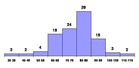
Figure 3.1: Histogram of waiting times between eruptions of old
faithful geyser
Also referred to at times as histograms are bar
charts
(see Section 2.1), such as the one shown in Figure 3.2.
The heights of the rectangles, or bars again represent the
class frequency but there is no pretense of having a continuous
horizontal scale.
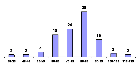
Figure 3.2: Bar Chart of distribution of waiting times between
eruptions of old faithful geyser |
|
3.5 Measures of
Association
In Chapter 2, we presented scatter diagrams, which graphically
depict variables that are related. In this section, we
present two numerical measure linear relationships depicted in a
scatter diagram. The two measures are covariance and the
coefficient of correlation.
Covariance
If we have all the observations that constitute a population,
we can compute population covariance. It is defined as follows.
Population covariance =

Where  is
the population mean of the first variable, is
the population mean of the first variable,
 is
the population mean of the second variable, Y; and N is
the size of the population. The sample covariance is defined
similarly, where n is the number of pairs of observation
sample. is
the population mean of the second variable, Y; and N is
the size of the population. The sample covariance is defined
similarly, where n is the number of pairs of observation
sample.
Sample covariance = 
For convenience, we label the population
covariance COV(X,Y) and the sample covariance COV(X,Y).
To illustrate how covariance measures association, the following
three sets of sample data are given.
|
|
x |
y |
 |
 |
|
|
Set 1 |
2
6
7 |
13
20
27 |
-3
1
2 |
-7
0
7 |
21
0
14 |
|
|
 |
 |
|
|
17.5 = cov(X,Y) |
|
|
x |
y |
|
|
|
|
Set 2 |
2
6
7 |
27
20
13 |
-3
1
2 |
7
0
-7 |
-21
0
-14 |
|
|
|
|
|
|
-17.5 = cov(X,Y) |
|
|
x |
Y |
|
|
|
|
Set 3 |
2
6
7 |
20
27
13 |
-3
1
2 |
0
7
-7 |
0
7
-14 |
|
|
|
|
|
|
-3.5 = cov(X,Y) |
In set 1, as x increases, so does y. In this
case, when x is larger than its mean, and y is at least
as large as its mean, thus
and
have
the same sign or zero, which means that the product is either
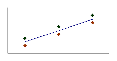
positive or zero. Consequently, the covariance is a positive
number. In general, if two variables move in the same direction
(both increase or both decrease), the covariance will be a large
positive number. Figure 3.3 depicts a scatter diagram of one
such case.
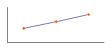
Next, consider set 2. As x increases, y decreases. Thus, the
signs of and
are
opposite. As a result, the covariance is a negative number. If,
as one variable increases, the other generally decreases, the
covariance will be a large negative number. See Figure 3.4 for
an illustrative scatter diagram.
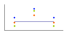
Now consider set 3. As x increases, y exhibits no particular
pattern. One product is positive, one is negative, and the third
is zero. Consequently, the covariance is a small number.
Generally speaking, if the two variables are unrelated (as one
increases, the other shows no pattern), the covariance will be
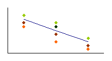
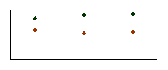
close to zero (either positive or negative). Figures 3.5, 3.6,
3.7, 3.8 describe the movement of two unrelated variables.
As a measure of association, covariance suffers
from a major drawback. It is usually difficult to judge the
strength of the relationship from the covariance. For example, suppose that you have been told that
the covariance of two variables is 250. What does this tell you
about the relationship between the two variables? The sign,
which is positive, tells you that as one increases, the other
also generally increases. However, the degree to which the
two variables move together is difficult to ascertain because we
don't know whether 250 is a large number. To over-come this
shortcoming, statisticians have produced another measure of
association, which is based on the covariance. It is
called the coefficient of correlation.
|
A
cov x,y > 0 |
B
cov x,y < 0 |
Figure 3.3
Figure 3.4
|
C
cov x,y = 0 |
D
r = + 1 |
Figure 3.5:
Figure 3.6
|
E
r = -1 |
F
r = 0 |
Figure 3.7
Figure 3.8
Coefficient of Correlation
The coefficient of correlation is the covariance
divided by the standard deviation of X and Y. The population coefficient of correlation
is labeled  Greek
and is defined as Greek
and is defined as

Where  and and
 are
the standard deviations of X and Y, respectively. We label
the sample coefficient of correlation r, which we
define as are
the standard deviations of X and Y, respectively. We label
the sample coefficient of correlation r, which we
define as

Where Sx and Sy are the sample
standard deviations of X and Y, respectively.
Solution:
We begin by calculating the sample means and standard
deviations.

We then compute the deviations from the mean for both x and y,
ant, their products. The following Table describes these
calculations.
|
X |
y |
 |
 |
 |
|
20.0
14.8
20.5
12.5
18.0
14.3
24.9
16.5
24.3
20.2
22.0
19.0
12.3
14.0
16.7 |
219
190
199
121
150
198
334
188
310
213
288
312
186
173
174 |
2.0
-3.2
2.5
-5.5
0.0
-3.7
6.9
-1.5
6.3
2.2
4.0
1.0
-5.7
-4.0
-1.3 |
2.0
-27.0
-18.0
-96.0
-67.0
-19.0
117.0
-29.0
93.0
-4.0
71.0
95.0
-31.0
-44.0
-43.0 |
4.0
86.4
-45.0
528.0
0.0
70.3
807.3
43.5
585.9
-8.8
284.0
95.0
176.7
176.0
55.9 |
|
Total = 2,859.2 |
Thus,

The coefficient of correlation is

USING THE COMPUTER
Excel Output for the Example
|
|
|
|
|
|
1 |
|
Size |
Price |
|
2 |
Size |
15.0667 |
|
|
3 |
Price |
190.6133 |
3808.667 |
Excel prints the population covariance and variances. Thus,
cov(X,Y) = 109.6133,
 =15.06667,
and =15.06667,
and  =
3,808.667. To compute the corresponding sample statistics,
multiply each by n/(n-1). Therefore, the sample covariance is
cov (X, Y) = 190.6133 =
3,808.667. To compute the corresponding sample statistics,
multiply each by n/(n-1). Therefore, the sample covariance is
cov (X, Y) = 190.6133
 (15/14)
= 204.2286. (15/14)
= 204.2286.
|
COMMANDS |
COMMANDS FOR EXAMPLE |
|
1 type or import the data into two columns
2 click Tools, Data Analysis …, and Covariance
3 Specify the coordinates of the data
|
Open file
A1:B16 |
From the output, we observe that r = .795716
Commands
Repeat the steps above, except click Correlation instead of
Covariance.
|
|
A |
B |
C |
|
1 |
|
Size |
Price |
|
2 |
Size |
1 |
|
|
3 |
Price |
0.795716 |
1 |
The covariance provides very little useful
information other than telling us that the two variables are
positively related. The coefficient of correlation informs us
that there is a strong positive relationship. This information
can be extremely useful to real estate agents, insurance
brokers, and all potential home purchas
Excel Output for the Example
|
|
A |
B |
C |
|
1 |
|
Odometer |
Price |
|
2 |
Odometer |
1 |
|
|
3 |
Price |
-0.806307604 |
1 |
Excel prints the coefficient of correlation. The test can
manually
|
COMMANDS |
COMMANDS FOR EXAMPLE |
|
1 type or import the data into adjacent columns
2 click Tools, Data Analysis …, and Correlation
3 Specify the input range. Click Labels in First row
(if necessary). Click OK
|
Open file
A1:B101 |
Interpreting the results
There is overwhelming evidence to infer that the two variables
are correlated.
Spearman Rank Correlation Coefficient
In the previous sections of this chapter, we have dealt only
with quantitative variables and have assumed that all of the
conditions for the validity of the hypothesis tests and
confidence interval estimates have been met. In many situations,
however, one or both variables may be ranked, or if both
variables are quantitative, the normality requirement may not be
satisfied. In such cases, we measure and test to determine if a
relationship exists by employing a nonparametric technique, the
Spearman rank correlation coefficient.
The Spearman rank correlation coefficient is
calculated like all of the previously introduced nonparametric
methods by first ranking the data. We then calculate the Pearson correlation coefficient of the
ranks.
The population Spearman correlation coefficient is
labeled  ,
and the sample statistics used to estimate its value is labeled ,
and the sample statistics used to estimate its value is labeled
 . .
Sample Spearman Rank Correlation Coefficient

Where a and b are the ranks of the data. |
|
3.6 Summarizing
Two-Variable Data
So far we have dealt only with situations involving one
variable- the room occupancies in Section 2.2, the waiting times
between eruptions of Old Faithful in Example 2.4, and so on. In
actual practice, many statistical methods apply to situations
involving two variables, and some of them apply even when the
number of variables cannot be counted on one's fingers and toes
not quite so extreme would be a problem in which we want to
study the values of one-family homes, taking into consideration
their age, their location, the number of bedrooms, the number of
baths, the size of the garage, the type of roof, the number of
fireplaces, the lot size, the value of nearby properties, and
the accessibility of schools.
Leaving some of this work to later work and, in fact, most of
it to advanced courses in statistics, we shall treat here only
the display, listing, and grouping of data involving two
variables; that is, problem dealing with the display of paired
data. In most of these problems, the main objective is to see
whether there is a relationship, and if so what kind of
relationship, so that we can predict one variable, denoted by
the letter y, in terms of other variable denoted by the letter x
.For instance, the x's might be family incomes and the y's
might be family expenditures on medical care, they might be
annealing temperatures and the hardness of steel, or they might
be the time that has elapsed since the chemical treatment of a
swimming pool and the remaining on concentration of chlorine.
Pairs (x, y), in the same way which we denote
points in the plane, with x, and y being their x- and
y-coordinates. When we actually plot the points corresponding to
paired values of x and y, we refer to the resulting graph as a
scatter diagram, a scatter plot, or a scatter gram. As
their name implies,
such graphs are useful tools in the analysis of whatever
relationship there may exist between the x's and the y's namely,
judging whether there are any discernible patterns.
Example (7)
Raw materials used in the production of synthetic fiber are
stored in a place that has no humidity control. Following are
measurement of the relative humidity in the storage place, x,
and the moisture content of a sample of the raw material, y, on
15 days
|
X
(Percent) |
Y
(Percent) |
|
X
(Percent) |
Y
(Percent |
|
36
27
24
50
1
23
45
44 |
12
11
10
17
10
12
18
16 |
|
3
32
19
34
38
21
16 |
14
13
11
12
17
8
7 |
Construct a scatter gram.
Solution
Scatter grams are easy enough to draw, yet the work can be
simplified by using appropriate computer software or a graphing
calculator. The one shown in Figure 3.9 was reproduced from the
display screen of a TI-83 graphing calculator.

Figure 3.9: Scatter gram of humidity and water content data
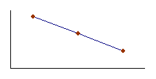
As can be seen from the diagram the points are fairly widely
scattered, yet there is evidence of an upward trend that is,
increase in the water content of the raw material seem to go
with increase in humidity. In Figure 3.9 the dots are squares
with their centers removed, but they can also be circles, x's
dots, or other kinds of symbols (The units are not marked to
either scale, but on the horizontal axis the tick marks are at
10, 20, 30, 40, and 50, and on the vertical axis they are at 5,
10, 15, and 20).
Some difficulties arise when two or more of the
data points are identical. In that case, the TI-83 graphing
calculator shows only one point and so do some of the printouts
obtained with statistical software. However,
MINITAB has a special scatter gram to take care of situations
like this. Its so called character plot prints the number 2
instead of the symbol x or
«
to indicate that there are two identical data points, and it
would print a 3 if there were three.
This is illustrated by the following example.
Example (8)
Following are the scores which 40 students obtained on both
parts of the test, with the scores on the even-numbered problems
denoted by x and the scores on the odd-numbered problems denoted
by y.
|
x |
y |
x |
y |
x |
y |
x |
y |
|
40
45
27
42
42
49
36
39
43
39 |
39
45
24
39
9
40
28
39
38
34 |
32
45
42
44
41
48
44
40
50
37 |
23
35
36
42
35
45
39
28
48
39 |
37
41
35
34
38
42
32
38
36
43 |
34
38
33
30
40
34
35
27
37
42 |
32
40
37
47
44
35
44
43
37
43 |
28
34
37
45
40
35
35
38
35
33 |
Choosing the five classes 26-30, 31-35, 36-40, 41-45, and
46-50 for x and the six classes 21-25, 26-30, 31-35, 36-4041-45,
and 46-50 for y, group these data into a two-way frequency
distribution.
Solution
Performing the tally, we find that the first of values, 40 and
39, goes into the cell belonging to the third column and the
fourth row, the second pair of values, 45 and 45, goes into the
cell belonging to the fourth column and the fifth row, and so
on. We thus get.
|
y |
|
x |
|
|
26-30 |
31-35 |
36-40 |
41-45 |
46-50 |
|
21-25 |
| |
| |
|
|
|
|
26-30 |
|
|| |
||| |
| |
|
|
31-35 |
|
||| |
|||| |
|||| |
|
|
36-40 |
|
|
|||| | |
|||| || |
| |
|
41-45 |
|
|
|
||| |
|| |
|
46-50 |
|
|
|
|
| |
and, hence, the following two-way frequency distribution :
|
y |
|
x |
|
|
26-30 |
31-35 |
36-40 |
41-45 |
46-50 |
|
21-25 |
1 |
1 |
|
|
|
|
26-30 |
|
2 |
3 |
1 |
|
|
31-35 |
|
3 |
4 |
5 |
|
|
36-40 |
|
|
6 |
7 |
1 |
|
41-45 |
|
|
|
3 |
2 |
|
46-50 |
|
|
|
|
1 |
|
|
|
|